
Color is a fundamental aspect of design and communication. Whether you’re a graphic designer, a web developer, or involved in any creative field, understanding color spaces is essential for achieving accurate and consistent results in your projects. Two primary color models used in the digital and printing world are RGB and CMYK. In this blog post, we will delve into the differences between RGB and CMYK, their respective advantages and limitations, and how to choose the right color space for your specific projects.
Quick answer: What is the difference between RGB and CMYK?
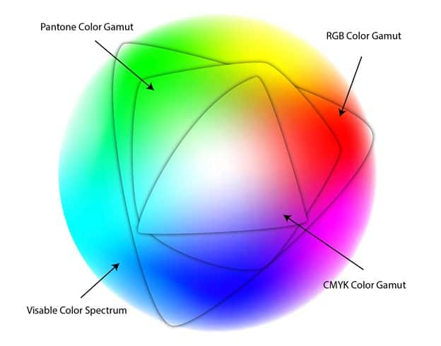
RGB and CMYK are two distinct color spaces with significant differences. RGB is used for digital displays, offering vibrant colors by combining red, green, and blue light. In contrast, CMYK is utilized for printing, using cyan, magenta, yellow, and black ink to produce accurate colors on paper. For digital projects, stick with RGB, and for printing, convert your files to CMYK to avoid color discrepancies. Remember to manage color consistency through calibration and consider Pantone spot colors when facing CMYK limitations. Understanding these distinctions empowers you to achieve stunning visuals, whether on screens or in print.
Understanding RGB Color Model:
The RGB color model utilizes three primary colors of light: Red, Green, and Blue. It’s an additive color space, meaning that when these three colors combine at full intensity, they create white light. RGB is commonly used in digital displays, screens, cameras, and other electronic devices, making it ideal for web design, social media graphics, and digital artwork. The RGB color space offers a vast range of colors, allowing for vibrant and dynamic visuals. However, it does have limitations, particularly when translating to printed media.
Understanding CMYK Color Model:
On the other hand, the CMYK color model relies on four primary colors of pigment: Cyan, Magenta, Yellow, and Black (Key). It’s a subtractive color space, meaning that when these four colors are combined at full intensity, they result in black (or very dark gray). CMYK is the standard color model for printing and reproduction processes, including brochures, posters, and other printed materials. While CMYK is excellent for accurately representing colors on paper, it has a narrower gamut compared to RGB, leading to potential color shifts when converting RGB artwork to CMYK.
Key Differences Between RGB and CMYK:
- Color Representation: RGB’s additive nature produces colors by emitting light, while CMYK’s subtractive nature uses ink to absorb and reflect light, creating color.
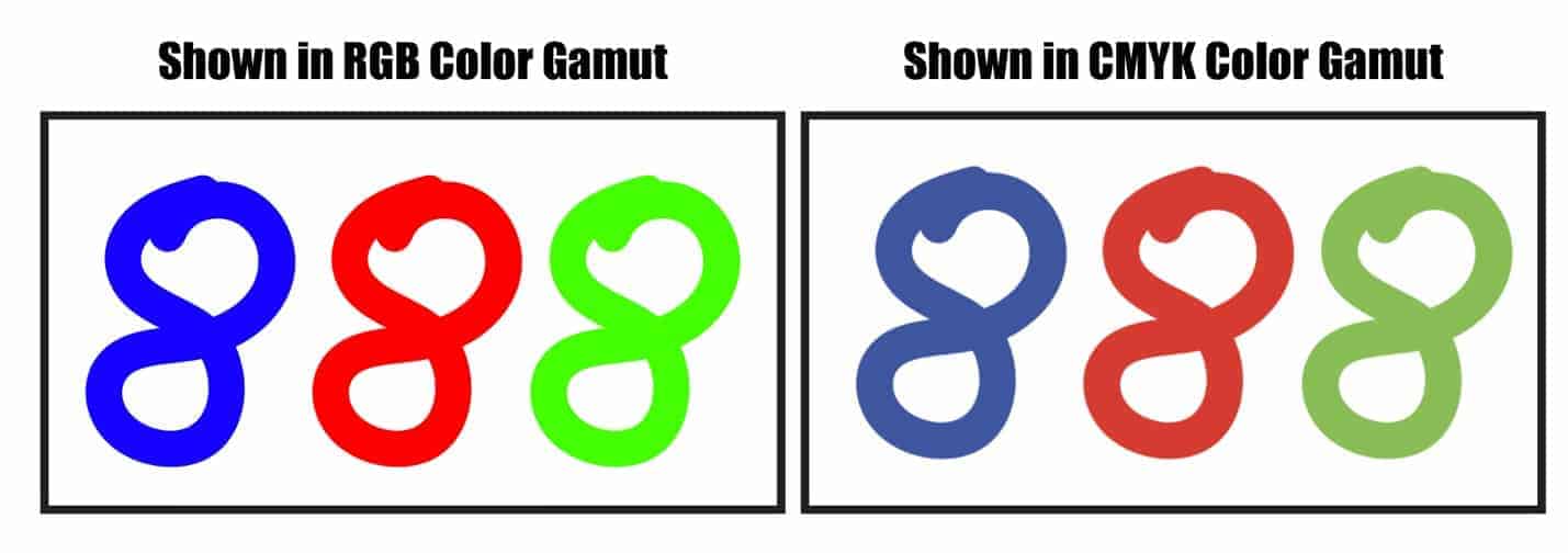
- Gamut Range: RGB has a larger color spectrum, making it capable of displaying more vibrant colors, whereas CMYK’s gamut is more limited, resulting in some colors being out of reach.
- Primary Colors: RGB relies on light-based primary colors, while CMYK uses pigment-based primary colors for printing.
- Color Mixing: Mixing light in RGB combines the primary colors, whereas in CMYK, inks are overlaid to create a desired color, which can lead to color inaccuracies when converting between the two spaces.
Choosing the Right Color Space for Your Projects:
When deciding between RGB and CMYK, consider the medium of your project. For digital work such as web design, online graphics, and social media posts, RGB is the way to go. Its vibrant colors and broader gamut are perfect for the screen. However, when preparing artwork for print, it’s crucial to convert your files to CMYK. Doing so helps you visualize how the colors will appear on the final printed product, avoiding unpleasant surprises due to color discrepancies.
Managing Color Consistency:
To ensure color accuracy across different devices and prints, color profiles like ICC profiles play a significant role. Calibrating your displays and printers is also crucial to maintaining color consistency in your workflow. Additionally, employing color management tools and software can streamline the process and reduce the likelihood of color-related issues.
Pantone and Spot Colors:
In some cases, certain colors cannot be achieved using the CMYK color space. This is where Pantone Matching System (PMS) colors come in. Pantone provides a vast array of spot colors that can complement CMYK and accurately reproduce specific hues. When precise color matching is essential, using Pantone spot colors alongside CMYK can ensure consistent and reliable results.
Pantone recently changed how their matching system works within Adobe Illustrator. This made it a mess for most designers, but we have a helpful guide for achieving the right colors.
Real-World Applications and Case Studies:
RGB in Web Design: Creating Engaging Online Visuals
RGB color space proves to be an excellent choice for web design and digital graphics. Its ability to utilize the additive nature of light, combining Red, Green, and Blue, results in a vast spectrum of vibrant colors that look captivating on screens. Designers can leverage this versatility to create eye-catching visuals, dynamic banners, and striking social media graphics. The RGB color space ensures a compelling online presence that grabs the audience’s attention and leaves a lasting impact.
The Pitfalls of Direct RGB-to-CMYK Conversion in Printing
While RGB is perfect for digital design, it poses challenges when translated directly to print media. The fundamental differences between the additive RGB and subtractive CMYK color spaces can lead to unexpected color shifts and disappointing results in printed materials. Many designers overlook the gamut differences between RGB and CMYK, which can lead to colors appearing dull or distorted on paper. To avoid these issues, it’s crucial to understand the limitations of each color space and make informed decisions during the conversion process.
Case Study 1: RGB’s Brilliance Falters in Print
A marketing agency executed a visually stunning digital campaign using RGB, leveraging the full spectrum of vibrant colors to create an engaging online experience. However, when it came to printing brochures and flyers for a promotional event, they neglected to account for the differences between RGB and CMYK. The result was a less impactful printed material, as the vivid digital colors failed to translate well onto paper. This case study highlights the importance of considering the intended medium from the outset and planning for color conversions to achieve consistent results across platforms.
Balancing RGB and CMYK: The Art of Logo Design
In logo design, versatility is essential since a logo will be used across various platforms. Designers often start by creating the logo in the RGB color space to ensure it looks perfect on websites and social media platforms, where vibrant colors are essential. However, they must also plan for print usage, such as business cards and stationery, which requires converting the logo to CMYK. The key lies in skillfully balancing both color spaces and making necessary adjustments during the conversion to preserve the logo’s visual appeal in both digital and printed forms.
Case Study 2: Seamless Brand Identity with Strategic Color Management
A brand sought to maintain a consistent identity across both digital and print materials. To achieve this, their designers carefully crafted a versatile logo in RGB. They then meticulously prepared the logo for dual usage, considering the transition to CMYK for printing while preserving the integrity of the brand’s color palette. The successful integration of RGB and CMYK resulted in a seamless and professional brand identity that looked impressive both online and in printed materials.
Conclusion:
Mastering the differences between RGB and CMYK is essential for achieving the best results in your design and printing endeavors. By understanding each color space’s strengths and limitations, you can make informed decisions that lead to stunning visuals both on screens and in print. Remember to convert your files to the appropriate color space for each project, and invest in color management techniques and tools to maintain consistent and accurate colors throughout your creative process. Happy designing!
Be sure to convert your files to CMYK before sending in files so you are aware of the print appearance. Previewing your print job in the CMYK color gamut gives you a more realistic expectation of your print results.